
Sunday 28 February 2016
The Prompts - Responding to and writing about images "Body langauge and facial expressions".
This is one of the easier prompts that can be written about when analysing and deconstructing images of people. We're almost all aware of how people communicate their feelings through their facial expressions and body language, so the way that we incorporate this aspect of making images has a significant impact on the way that the image is perceived. Similarly it's probably one of the most productive options when using the prompts to deconstruct and analyse images.
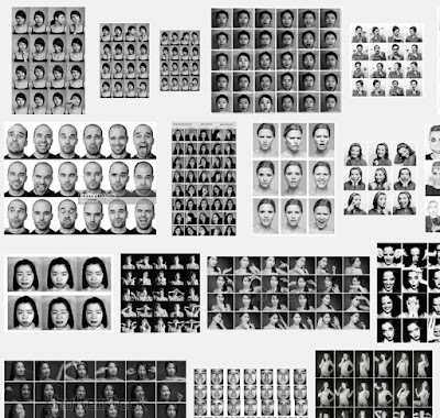 When doing this we can't discount the surrounding factors - backgrounds, props, clothing, body language, semiotics, location, relationships and accompanying text. All of this is rich in potential meaning allowing you write and comment about the images. What do the expressions or body language tell us about the person and their environment, how has the photographer used this aspect of their photography? Is it intentional, natural or constructed? How significant is the facial expression or body language, is it subtle or is it a massive part of the image narrative?
How to put together your research for a photography project
Here's my current thoughts and suggestions as to putting together a photography research project.
It's an essential part of your studies on any level 3 photography courses (UAL, BTEC or A-Levels) that you study historic and contemporary photographers. Over the years I've suggested all sorts of different ways of doing it, but this is my current suggestion and I reckon it's the most efficient and easiest way I come up with and I'd like to think that our students will recognise it and adopt it.
Almost without exception the units and assignments on photography courses require that you put together research prior to shooting your images. Your images need to be informed or influenced by the work of other 'Significant' photographers. We advise that your starting point for finding such photographers is the British Journal of Photography, books such as 'Photography The Whole Story' or my list of contemporary and historic photographers which you can find here . It's important that you list your sources in a bibliography and all examination bodies and lecturers like to see and sometimes require that you identify the use of books.


 There are number of reasons for this. (a). You can edit the work easily, so many students change their minds about the way they work and produce work out of order leaving blank pages with the intention of filling them in later and then they run out of time. With these folders you can swap and change and omit work easily/ (b). Most colleges have photocopy machines with A3 paper and you're probably allowed to take a few sheets of paper if you ask your lecturers and this reduces costs. (c). I recommend as below you use one side of a two page spread almost exclusively for the images you find associated with the photographer you're researching and on the adjacent page a key image about A5 size surrounded by your written work. (d). When you hand in your finals they look impressive as A3 images or surrounded by a white mount affect when printed as A4's on an A3 mount. If you spend the time and money acquiring high quality finals as you complete each of your projects these can be removed and added to a final portfolio at the end of the year.
It's an essential part of your studies on any level 3 photography courses (UAL, BTEC or A-Levels) that you study historic and contemporary photographers. Over the years I've suggested all sorts of different ways of doing it, but this is my current suggestion and I reckon it's the most efficient and easiest way I come up with and I'd like to think that our students will recognise it and adopt it.
Almost without exception the units and assignments on photography courses require that you put together research prior to shooting your images. Your images need to be informed or influenced by the work of other 'Significant' photographers. We advise that your starting point for finding such photographers is the British Journal of Photography, books such as 'Photography The Whole Story' or my list of contemporary and historic photographers which you can find here . It's important that you list your sources in a bibliography and all examination bodies and lecturers like to see and sometimes require that you identify the use of books.


Anyway down to the process. We'll assume that you take the correct approach to your research and research all the time using the right methods.
(1). This is a visual subject and you need to make your work look as though you're interested in images. Therefore the balance between written work and the use of images in your research should be 50/50.
(2). I advocate the use of A3 display folders...
 There are number of reasons for this. (a). You can edit the work easily, so many students change their minds about the way they work and produce work out of order leaving blank pages with the intention of filling them in later and then they run out of time. With these folders you can swap and change and omit work easily/ (b). Most colleges have photocopy machines with A3 paper and you're probably allowed to take a few sheets of paper if you ask your lecturers and this reduces costs. (c). I recommend as below you use one side of a two page spread almost exclusively for the images you find associated with the photographer you're researching and on the adjacent page a key image about A5 size surrounded by your written work. (d). When you hand in your finals they look impressive as A3 images or surrounded by a white mount affect when printed as A4's on an A3 mount. If you spend the time and money acquiring high quality finals as you complete each of your projects these can be removed and added to a final portfolio at the end of the year.
So this is the way I would suggest that you compile your work

So this above would be an A3 double page spread. The recommendation is that you do make it visual and have it so that 50% of the work is made up of images.

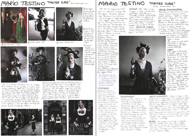
So the image above is the 'Image page'. When you find your initial or key image you'll probably find associated images collect them all together as files and then print them off - print off about 8 or 9 approx. A6 in size. If you use a PC (proper computer) in windows select four images to print and windows will neatly nest four images on the page to print at a time onto A4.
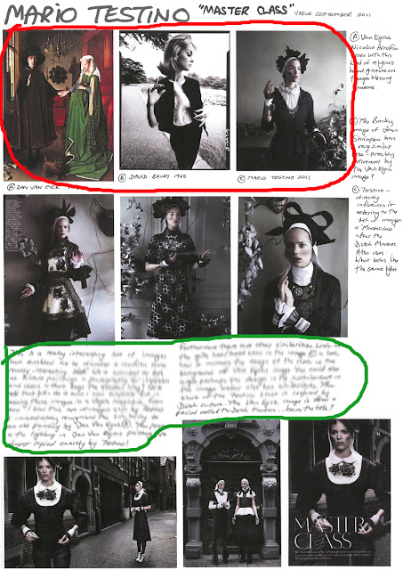
At the top of the page you'll see a couple of images that are associated with the Testino images by virtue of the pose. The pose looks to be inspired by Jan Van Eycks 'Arnolfini Portrait' and interestingly I noticed that it also was similar to David Bailey's photograph from the 1960's of Jean Shrimpton. It maybe that both photographers were inspired by the work of Jan Van Eyck and realising that this image has stood the test of time for several hundreds of year was a pretty safe bet to use as stylish pose? Where possible and as much as possible look for these kind of links and identify them (This is the reason you're encouraged to look at images constantly).
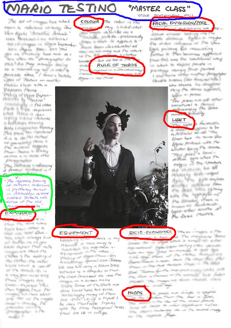
Include on this page if you wish some written work. As I developed this approach I started to use this page to write up my initial observations and immediate thoughts about the images. On the adjacent page below I then wrote up the facts rather than opinion and speculation.

Make sure both pages (Ringed Blue) have a big clear title including the name of the work/images. From your initial research where you collate all of the images pick a key image that you feel you can write about - possibly the first one you noticed or the one with the most interesting features. * As you collect the images from the website, save some of the HTML addresses to include in your bibliography. Also look at the website in case there's some written content that gives you more information about the images. If there's not then start to look around for written content that is associated with the artist or the images. The best way to do this is type in the name of the photographer pre-fixed with "Interview with" so I would have tried a number of searches using...
Interview with Mario Testino
Vogue masterclass September 2011
Vogue master class interview Mario Testino
I'd have repeated the same searches on Google but with a video search enabled. This generally brings up some really good resources and it was through watching the video of Testino shooting a Japanese shoot for Vogue that I identified his own research methods and the equipment and lighting he uses on set. All very much worth looking at.
Two interviews is generally enough, along with videos and the original sources from the BJP to get enough information to write about the image/s using the prompts (Circled in Red). If you're struggling generate written responses to the images use these prompts (see the sidebar to the write of this blog page).
Try and generate for your Final Major project at least ten pieces of research like this independently. You'll get the chance to practice this in class with help, but to push the work on to Merit level you need to be seen generating your own research more specific to your own needs.
A very similar approach can be used in conjunction with your practical sessions and another video and series of images will be added after I've made the resources.
Why research photographers all the time and why use the British Journal of Photography and books?
Since the advent of digital photography the studying of photography at college has had to adapt and change. Prior to digital when we all used to have use film it was difficult to do the basics such as make an exposure that was correct, focus the image so that it was sharp and make choices about what films to use. It would be the case that most people would shoot a roll of film and to be really brutal 30 of the 36 frames would be appallingly bad. So when you went on a course a significant part of the teaching and learning was around these basics. Therefore the other aspects of the course - visual language, historical context... the more academic components had a lesser significance.
Then 'Auto-focus' and digital came along and the whole thing got a lot easier. You only have to go on-line now and you'll find gazillions of images that are well-exposed and sharp, every numpty on the planet can now do what used to take some people a life-time to do. One of my students made the point...
"So that means all the crap that used to be hidden away in shoe boxes and family albums is now all over the internet... how on earth are we supposed to separate the two"?
Well, that's one of the things we aim to teach you - how to research properly and the bottom line is keep it simple and only source your photographers from journals such as the British Journal of Photography and books such as Photography The Whole Story - (Juliet Hacking and David Campany).
Things have changed...
So now when you're at college, one of the key things you need to do alongside learning how to make pictures is learn about photographers... Study photographers and Photography. Why are images made, what purpose do they serve, how do they communicate to their audience, who is their audience, how is visual language used to communicate the message and how do we generate ideas and concepts to produce something that is fresh, new and informed.
So at the end of the course one aspect of your learning is that you should be able to confidently speak about your images explaining what and who they are influenced by, and how you use visual language to communicate the message within your image/s. Your images unlike all the millions on Google images will be about something rather than of something your images will be rich in content and informed by the work of others.
The way this is done is through the study of other significant photographers and your first port of call for such study to be affective is journals such as the British Journal of Photography or Hotshoe. You are strongly advised to subscribe to the BJP whilst on the course and use it as the starting point of your research and studies. Make sure you compile bibliographies of your sources and include books and journals.
Saturday 27 February 2016
The Prompts - Responding to and writing about images "Meaning and message".
For this one you're looking to identify what the images are about and what they are trying to convey - what is the meaning and the message within the image/images?
If you're accessing the right kind of sources for your research - journals such as the British Journal of Photography or books, the chances are you're going to be able to get a sense of the meaning behind the images because you're looking at research material where this aspect of the photography is discussed and identified.
When you're looking at images some of the key questions you need to be asking is what are these images about and what are the images trying convey? It's easy to identify what they're of, but the deeper questions are more complex and difficult to identify what the meaning is.
The process you should adopt should be one of initially offering a suggestion as to what the images could be about. But, then you must do the research and look for reviews and interviews and try and ascertain the facts. Generally in interviews the photographer will be asked about and will explain the meaning behind the images. Another good source for such information is the photographers own websites. Look for the specific body of work or series of images and they'll be accompanied by an introduction and explanation to the work. Look also for links to reviews on the photographers website, have a look through these too.
The Prompts - Responding to and writing about images "Influence and connections".
Identifying the influence of the work your researching is another of the really important parts of your research process.
Probably the most effective way of finding this information is to search using interviews. Once you've found the photographer or the work that you are going to use as a part of your research initially using journals or books (Remember to compile your bibliography as you go), then use the internet once you have the photographers name. In your search pre-fix the photographers name with 'Interview'...
 We would always advise you to find a minimum of two different interviews or articles in conjunction with your research. Usually, irrespective of who asks the questions this important aspect is covered, almost every interviewer will ask "Who are you inspired by" or "Who are you influenced by"?
Check Youtube, Vimeo, Dailymotion and other video websites for video interviews.
Once you've found the information...
Find images of the work the that photographer has been inspired by. If for instance you had researched Hans Van Der Meer in one of his interviews he gives a specific example of who inspires his Football pitch series...
Hendrich Avercamps Skaters

Making these connections and doing this additional layer of research is absolutely essential if you're looking to attain higher grades. This secondary layer only really requires that you include images and then annotate the additional 'Historic' image in terms of what you recognise as being similar in the work.
This broadens your knowledge beyond photography and identifies the historical context. Furthermore it demonstrates that photographers use historic images as key reference points for their own work.
Probably the most effective way of finding this information is to search using interviews. Once you've found the photographer or the work that you are going to use as a part of your research initially using journals or books (Remember to compile your bibliography as you go), then use the internet once you have the photographers name. In your search pre-fix the photographers name with 'Interview'...

Check Youtube, Vimeo, Dailymotion and other video websites for video interviews.
Once you've found the information...
Find images of the work the that photographer has been inspired by. If for instance you had researched Hans Van Der Meer in one of his interviews he gives a specific example of who inspires his Football pitch series...
Hendrich Avercamps Skaters

Making these connections and doing this additional layer of research is absolutely essential if you're looking to attain higher grades. This secondary layer only really requires that you include images and then annotate the additional 'Historic' image in terms of what you recognise as being similar in the work.
This broadens your knowledge beyond photography and identifies the historical context. Furthermore it demonstrates that photographers use historic images as key reference points for their own work.
The Prompts - Responding to and writing about images "Composition".
As soon as you're visually aware as a child you'll start to see images... On television, on computer screens, in newspapers, books and magazines and you'll be presented with images that generally conform to the rule of thirds. If you're still unsure what the rule of thirds is and how it's used in photography and paintings - type 'Rule of thirds' in Google and you'll see thousands of examples.
Generally when I initially explain it I use as an example one of Thomas Ruffs deadpan portraits.

These image conventional compositions with the person sitting in the central third with the eyes falling on the top third intersection. Look through historical paintings and most portrait photography these conventions generally apply. Given a camera and told to take a photograph someone - most people will apply these rules. So when deconstructing your research images and analysing them, this is one of the basic things you can discuss in your work. Do the images you're looking at stick to these conventions or break the rules? If the image doesn't conform to the rule of thirds - why do you think it doesn't - what is the photographer trying to do?
Think about the space that's possibly been created, think about the use of the image - is the space there to provide space for text perhaps?
Breaking the frame
Look at your research images and look at the key subject in the image or the main components - do any of them break the frame or are all the elements of the image contained nicely within the frame? If they do break the frame as in the sheep here in this famous painting by William Holman Hunt 1852 "Strayed Sheep" at Fairlight in Sussex. Why?
 A lot of fashion Photography despite the fact that it is constructed and planned includes this aspect of composition - why? Look at fashion images and you'll see limbs and parts of bodies cut off by the frame of the image - do you think this right or wrong - does it matter, do the limbs need to be in the image? Are there rules for instance when you shoot someone standing up about where you should cut through their legs when shooting the image as a 2/3rd or 3/4 length portrait?
Negative space
When and why might you leave space in a picture? Why do we shoot portraits as upright compositions, why is that the right way? Similarly why are most landscapes horizontal - and what if we use a square format camera - how does that effect the composition and the balance of the image? What are your thoughts on the matter? See this article here.
Look at the images that you're researching or analysing and discuss them in these terms.
How big in the frame?
Looking at the image what can you say about the way the 'Subject' is framed, is it close or far away - why? Would it affect the way that we read the image and make sense of it if the subject was closer or further away. What is the relationship between the subject and the background or surrounding subjects?
People -
If there is more than one person in the frame - how have they been composed in relation to each other? The space between the people - what does it suggest about their relationship?
Viewpoint -
Where has the photograph been taken from - again this is very significant when it's in conjunction with the image of people. Has the photographer shot the image on the same eye-level as the subject? How does this affect the reading of the image - what does it suggest about the relationship between the photographer and the subject?
What if the photographer is higher than the subject - how does this affect the psychology of the image and the opposite... the photographer is lower than the subject? All of these things have a very significant bearing on the way the images are perceived.
Generally when I initially explain it I use as an example one of Thomas Ruffs deadpan portraits.
These image conventional compositions with the person sitting in the central third with the eyes falling on the top third intersection. Look through historical paintings and most portrait photography these conventions generally apply. Given a camera and told to take a photograph someone - most people will apply these rules. So when deconstructing your research images and analysing them, this is one of the basic things you can discuss in your work. Do the images you're looking at stick to these conventions or break the rules? If the image doesn't conform to the rule of thirds - why do you think it doesn't - what is the photographer trying to do?
Think about the space that's possibly been created, think about the use of the image - is the space there to provide space for text perhaps?
Breaking the frame
Look at your research images and look at the key subject in the image or the main components - do any of them break the frame or are all the elements of the image contained nicely within the frame? If they do break the frame as in the sheep here in this famous painting by William Holman Hunt 1852 "Strayed Sheep" at Fairlight in Sussex. Why?

Negative space
When and why might you leave space in a picture? Why do we shoot portraits as upright compositions, why is that the right way? Similarly why are most landscapes horizontal - and what if we use a square format camera - how does that effect the composition and the balance of the image? What are your thoughts on the matter? See this article here.
Look at the images that you're researching or analysing and discuss them in these terms.
How big in the frame?
Looking at the image what can you say about the way the 'Subject' is framed, is it close or far away - why? Would it affect the way that we read the image and make sense of it if the subject was closer or further away. What is the relationship between the subject and the background or surrounding subjects?
People -
If there is more than one person in the frame - how have they been composed in relation to each other? The space between the people - what does it suggest about their relationship?
Viewpoint -
Where has the photograph been taken from - again this is very significant when it's in conjunction with the image of people. Has the photographer shot the image on the same eye-level as the subject? How does this affect the reading of the image - what does it suggest about the relationship between the photographer and the subject?
What if the photographer is higher than the subject - how does this affect the psychology of the image and the opposite... the photographer is lower than the subject? All of these things have a very significant bearing on the way the images are perceived.
Thursday 25 February 2016
Film rebate - film edge
Who made using the film edge (Rebate) in photographic prints a trend?
I was born in 1960, so lived through that decade and subconsciously picked up on the conventions that connote classic 1960's photography. During the period I would have heard of and seen the work of David Bailey despite the fact that at that time my interest in photography was minimal.
Over the years this perception of what a classic 1960's image looks like, seems to have been reinforced and for me it includes a series of conventions that when combined are definitely of that era.
As a lecturer in photography I have introduced an assignment for our level 3 students where they have to conduct a 1960's fashion/portrait shoot using those same conventions. I would argue that the visual language of the images is unmistakably of that period if most of the conventions are adopted in the construction of the image. Needless to say the styling, poses and choice of location and props finishes the image off leaving the viewer in no uncertain terms that what they are looking at is a 1960's pastiche.
These image conventions include the following
(1). The use of a classic film type such as Kodak Tri-x, FP4 + or HP5+.
(2). If shot in the studio - simple white or grey background, the white background being allowed to fall off to a grey or lit separately to create a white background.
(3). The use of a 6x6cm format camera such as a Mamiya C330, Hassleblad, Bronica SQA or Rolleiflex.
(4). Simple studio lighting - a medium reflector dish set-up in the way that Bailey would have used, or point light with a spill-kill and minimal fill-in dependent on whether the model was male or female.
(5). Strong compositions, again using Bailey as the inspiration.
(6). Print the images punchy with good to exaggerated contrast.
(7). Print with the film edge/rebate creating a border around the image including the film type details and for realism - scratch numbers into the rebate to indicate which neg is to be printed.
Most of these details are to be found in books and on-line in various places with regard trying to figure how to create a 1960's pastiche, but the one that is never mentioned is No.7 the one that relates to the use and inclusion of the film edge/rebate.
As I said - this is my perception and it is not set in granite. What I do know and have discovered is that this isn't exclusive to David Bailey and that before him there are at least two of the great photographers using the same technique...
Irving Penn

 As you can see here, both these images from the 'Corner' series were printed with the inclusion of the rebate (Black film edge), both shots were made in the 1940's. The top image being Marlene Dietrich from 1947 and Mrs Rhineland-Stewart from 1948.
After Penn in 1957, Richard Avedon (below) conducted a famous shoot featuring Marilyn Monroe which is owned by the Museum of Modern Art. This too (well before Bailey) features the inclusion of the border, along with the printed numbers and name of the film. In addition there's scruffy scratched figure which can't be made out, but is probably there to indicate which is the preferred negative on the strip of film.

If we research using the internet you'll find variations of both the Penn and Avedon images and they don't always include the rebate. I personally don't have any hard-copy books that have either sets of these images in, so I can't ascertain whether when published previously with the permission of the photographers or their estate their were instruction to always include the rebate? The MOMA image does have the rebate and the sense I therefore have is that it's an integral part of the images visual language and design... Avedon would have possibly insisted that the image be reproduced with the film edge?
Irving Penn on the other hand or at least the Museum of Chicago seem to be a little ambiguous about the inclusion or exclusion of the rebate (See here) so are we to conclude that the film edge was less significant to Penn?
Then along comes the 1960's and the break- through of the working classes into a world that was primarily dominated by the middle classes - Fashion Photography. To me, there then seems to be a proliferation of the use of the film edge in the final prints especially when displayed in galleries.
Interestingly in the video here we can see the now legendary 'Box of Pin-ups' being looked at and there's no use of the rebate whatsoever, yet the images include those that you will see regularly replicated on the internet with the inclusion of the rebate. (30 mins into the video).

To be continued...
Similarly to the other examples I've loo
I was born in 1960, so lived through that decade and subconsciously picked up on the conventions that connote classic 1960's photography. During the period I would have heard of and seen the work of David Bailey despite the fact that at that time my interest in photography was minimal.
Over the years this perception of what a classic 1960's image looks like, seems to have been reinforced and for me it includes a series of conventions that when combined are definitely of that era.
As a lecturer in photography I have introduced an assignment for our level 3 students where they have to conduct a 1960's fashion/portrait shoot using those same conventions. I would argue that the visual language of the images is unmistakably of that period if most of the conventions are adopted in the construction of the image. Needless to say the styling, poses and choice of location and props finishes the image off leaving the viewer in no uncertain terms that what they are looking at is a 1960's pastiche.
These image conventions include the following
(1). The use of a classic film type such as Kodak Tri-x, FP4 + or HP5+.
(2). If shot in the studio - simple white or grey background, the white background being allowed to fall off to a grey or lit separately to create a white background.
(3). The use of a 6x6cm format camera such as a Mamiya C330, Hassleblad, Bronica SQA or Rolleiflex.
(4). Simple studio lighting - a medium reflector dish set-up in the way that Bailey would have used, or point light with a spill-kill and minimal fill-in dependent on whether the model was male or female.
(5). Strong compositions, again using Bailey as the inspiration.
(6). Print the images punchy with good to exaggerated contrast.
(7). Print with the film edge/rebate creating a border around the image including the film type details and for realism - scratch numbers into the rebate to indicate which neg is to be printed.
Most of these details are to be found in books and on-line in various places with regard trying to figure how to create a 1960's pastiche, but the one that is never mentioned is No.7 the one that relates to the use and inclusion of the film edge/rebate.
As I said - this is my perception and it is not set in granite. What I do know and have discovered is that this isn't exclusive to David Bailey and that before him there are at least two of the great photographers using the same technique...
Irving Penn


After Penn in 1957, Richard Avedon (below) conducted a famous shoot featuring Marilyn Monroe which is owned by the Museum of Modern Art. This too (well before Bailey) features the inclusion of the border, along with the printed numbers and name of the film. In addition there's scruffy scratched figure which can't be made out, but is probably there to indicate which is the preferred negative on the strip of film.

If we research using the internet you'll find variations of both the Penn and Avedon images and they don't always include the rebate. I personally don't have any hard-copy books that have either sets of these images in, so I can't ascertain whether when published previously with the permission of the photographers or their estate their were instruction to always include the rebate? The MOMA image does have the rebate and the sense I therefore have is that it's an integral part of the images visual language and design... Avedon would have possibly insisted that the image be reproduced with the film edge?
Irving Penn on the other hand or at least the Museum of Chicago seem to be a little ambiguous about the inclusion or exclusion of the rebate (See here) so are we to conclude that the film edge was less significant to Penn?
Then along comes the 1960's and the break- through of the working classes into a world that was primarily dominated by the middle classes - Fashion Photography. To me, there then seems to be a proliferation of the use of the film edge in the final prints especially when displayed in galleries.
Interestingly in the video here we can see the now legendary 'Box of Pin-ups' being looked at and there's no use of the rebate whatsoever, yet the images include those that you will see regularly replicated on the internet with the inclusion of the rebate. (30 mins into the video).

To be continued...
Similarly to the other examples I've loo
Monday 8 February 2016
The Prompts - Responding to and writing about images "Light".
This is an important one to always include as it
demonstrates your knowledge of how light is used. For this you need to look at
the light and judge whether the photographer has used available light, studio
flash, flash guns, daylight or a mixture of any of these or something
different? You should then write about the quality of the light in terms of it
being ‘diffuse’ or ‘Point’ light, discussing the impact this has on the image –
shadows, contrast, definition, flattening, vibrancy of the colour. Does the light
set the mood in the image; does it make the image look dark, sinister, bright
or happy? Think about and discuss the light in terms of other aspects of
photography you’ve previously learned about – does it look like another
practitioners (Photographers) lighting style, does it help with making image
look objective or subjective, is the light full of drama or is it neutral?
Say why you think the photographer has made these choices –
how relevant is the light to the image overall - is it inconsequential or
fundamental? Could the light be used differently – is the light consistent or
inconsistent across a series of images – think about the Becher’s for instance
all of their images had a uniformity by virtue of only ever making their images
when the light was of one specific type/quality.
With interior shots featuring people or objects, look at
where the light is falling, look at reflections in the eyes and other
reflective surfaces or objects – look for clues as to what kind of light has
been used? Is it simple or is it complex?
Monday 1 February 2016
The Prompts - Responding to and writing about images "Audience".
Audience -
For this, within your research you have to figure out who the audience is for the images you're looking at. For the most part you're encouraged to look at 'Personal work' as opposed to the photographers commissioned work, reason being, the wider photographic community is far more interested in personal projects undertaken by the photographer than their day to day commissions. As part of the making sense of the audience you're going to have to identify how you think the images are intended to be used and what their purpose is? You'll have to research or speculate initially, how you think the work will be presented and in what format - exhibition, book, touring show, limited private sales, auction houses etc. This will give you some sense of who the target market is.
If you dig a little deeper... Try typing your photographers name in Google and adding 'Sold at Auction' you'll get an insight into how much the individual prints or books cost. Look up Peter Beards limited edition book at Taschen - who do think the Audience is for his work - who is his buying public? Would you expect to see his books being sold in WH Smiths in the high street?
Different photographers have different approaches to marketing themselves, dependent on the message within their work, so for some there will be a balance that's needed to be struck between addressing and accessing your audience in order that you get the message out there. What's the point of having something to say through your photography if it's only ever going to be known within an exclusive group of people?
So, when you're researching - get a feel for who is going to be interested in the images and themes you're highlighting. In the same way that you make sense of people's socio-economic status in the images - think too about the people that buy and access the photography... Who are they? Rich, poor, educated, Guardian readers, Daily Mail readers, amateur photographers, young, old, black, white, female, students or professionals?
One of Art's greatest challenges is to make Art more accessible to a wider public and not just to the educated middle classed. So with this in mind - look at your photographer, look at the message, meaning, theme and content and ask and explain how it addresses these differences if it does at all?
Subscribe to:
Posts (Atom)